
Histogram
A histogram is a representation of a frequency distribution by means of rectangles whose widths represent class intervals and whose areas are proportional to the corresponding frequencies.
We can built as simple histogram for groups of numbers according to how often they appear. Thus if we have the set {1,2,2,3,3,3,3,4,4,5,6}, we can graph them like this:
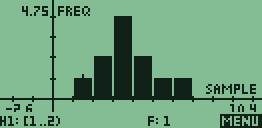
This graph is pretty easy to make and gives us some useful data about the set. For example, the graph peaks at 3, which is also the median and the mode of the set. The mean of the set is 3.27 also not far from the peak. The shape of the graph gives us an idea of how the numbers in the set are distributed about the mean: the distribution of this graph is wide compared to size of the peak, indicating that values in the set are only loosely bunched round the mean.
How is a Real World Histogram Made?
The example above is a little too simple. In most real data sets almost all numbers will be unique. Consider the set {3, 11, 12, 19, 22, 23, 24, 25, 27, 29, 35, 36, 37, 45, 49}. A graph which shows how many ones, how many twos, how many threes, etc. would be meaningless. Instead we bin the data into convenient ranges. In this case, with a bin width of 10, we can easily group the data by rounding up to the nearest 10th.
3 ~ 10
11 ~ 20
12 ~ 20
19 ~ 20
22 ~ 30
23 ~ 30
24 ~ 30
25 ~ 30
27 ~ 30
29 ~ 30
35 ~ 40
36 ~ 40
37 ~ 40
45 ~ 50
49 ~ 50
Note: Changing the size of the bin changes the appearance of the graph and the conclusions you may draw from it. The Shodor histogram activity allows you to change the bin size for a data set and the impact on the curve.
Histograms allow us to analyzeextremely large datasets by reducing them to a single graph that canshow primary, secondary and tertiary peaks in data as well as give avisual representation of the statistical significance of those peaks.